Ever struggled reading a blog post because the font was too small? Or tried to make an online purchase, only to face a lengthy, confusing process? Maybe you've clicked endlessly on tiny buttons or misread mobile app navigation icons? Perhaps you've even felt lost on a website, unsure of what to do next?
If any of this sounds familiar, you've encountered a user experience (UX) issue. And while UX and UI (user interface) are often confused, they are not the same. UX is about the overall experience, including how the site performs and how users feel about it. UI, on the other hand, is focused on the visual design, aesthetics, and interactivity. Simply put, UI is just one component of UX.
Good UX is crucial—it directly impacts your site's performance and conversions. Understanding this link between UX and conversion rates is a great starting point, but knowing how to improve it is key. Below are some common UX mistakes to avoid, helping you reposition your site for success.
Not Considering User Needs and Goals
Designing without a clear understanding of your users' needs and goals is a common pitfall. The design should always center around helping users achieve their objectives, not just reflect the preferences of the design team or business. Failing to meet user needs often results in a poor experience and low engagement. Keep user needs at the forefront during every stage, from research to testing.
Ignoring Usability Best Practices
Usability best practices, established through research and experience, guide designers in creating user-friendly interfaces. Ignoring these can result in cluttered, confusing designs. Here are a few usability principles to follow:
- Keep the interface simple and uncluttered.
- Ensure the interface is visually appealing.
- Use standard UI elements and conventions.
- Provide clear instructions and labels.
- Make sure the interface works well across devices.
Following these guidelines can prevent user frustration and improve the overall experience.
Failing to Test with Real Users
User testing is essential for identifying problems and improving the design. By testing with real users, you can ensure the interface meets their needs. Methods like user interviews, usability testing, and focus groups help pinpoint areas of improvement. Skipping this step can result in designs that don’t perform well in real-world scenarios.
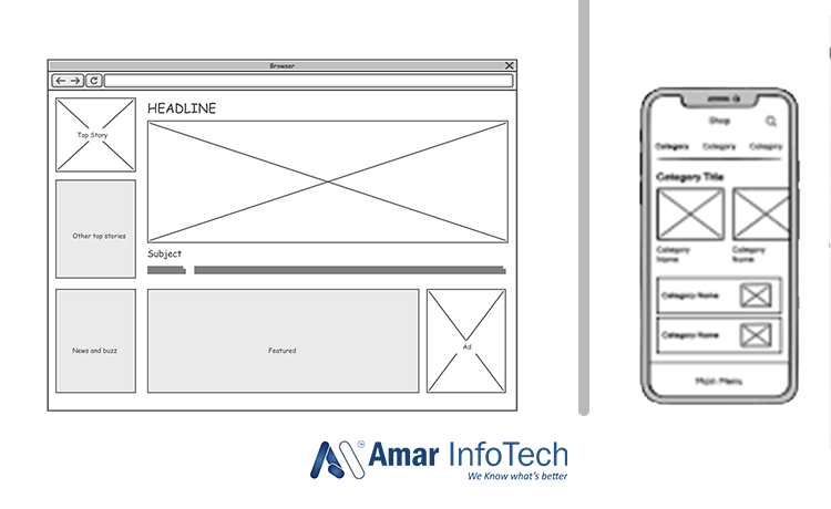
Lack of Clear Information Hierarchy
A clear hierarchy of information helps users navigate a site easily and understand its content. Poorly organized content can confuse users and make it difficult to find what they’re looking for. Use clear headings, subheadings, and concise language to create a logical structure that users can follow.
Using Non-Standard UI Elements
Non-standard UI elements that don’t follow familiar design conventions can confuse users. Stick to standard elements to ensure users can navigate your interface intuitively. Introducing unfamiliar UI components may lead to frustration and a poor experience.
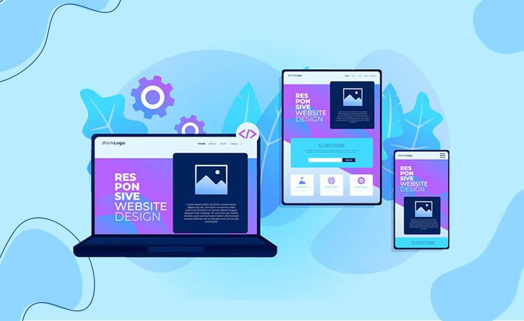
Neglecting Mobile Users
With the rise of mobile browsing, failing to optimize your website for mobile devices is a critical mistake. A responsive design, readable content, and fast loading times are essential to providing a smooth mobile experience. Neglecting mobile users can lead to higher bounce rates and lost conversions.
Not Using Clear and Concise Language
Complicated or unclear language can turn users away. Always use simple, straightforward language that is easy to read and understand. Avoid jargon and technical terms that may confuse users.
Failing to Provide Clear Feedback
Clear feedback, such as error messages or confirmation prompts, is key to helping users understand what’s happening on your site. Without it, users can become frustrated and unsure of how to proceed. Always provide clear, actionable feedback to enhance the user experience.
Many site owners struggle to recognize UX issues, which can hinder user satisfaction and performance. Optimizing user experience requires a focus on every element of interaction. If you're looking to improve, start by addressing these common UX mistakes and you'll likely see better engagement and conversions.
Recent Blog


Services
Build Your Agile Team Today..
Inquiry Now