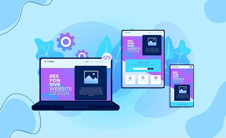
Hello.! All. Welcome to another edition of our technology blog where we take the current issues of the IT field, especially related to the developer, designer, and the tester. Today, our focus will be on providing you with the ultimate guide to responsive vs adaptive web design.
Responsive vs Adaptive web design has been a topic of hot discussion in the recent times and that’s why we thought that we should write a blog on this so that all the designers and developers can get some detail insights regarding it. The second reason behind writing this blog was to make all the Newbie or the Freshers aware of this new concept.
Are you working as a designer in the IT field? Are you confused about which web design is the best? Then don’t be so. Today, we are going to give you a detailed analysis of Responsive and Adaptive web design which will help you understand it in a better way.
Need of Responsive and Adaptive Web Design:-
Before understanding the concept of Responsive and Adaptive web design, we need to understand the need for using these web designs.
We are living in the 21st century and it is an era of technology and technocrats. The evolution of technology has been so dramatic in the last decade or so that it has allowed us the flexibility and mobility like never before. Mobile has also played the key role in this evolution, nowadays due to smartphones, everything is just a click away.
According to a survey of Global Web Index,67% of internet users are accessing the web via mobiles which is massive because more than ⅔ of the users access any website via their mobile. So it’s very important for the web designer to make its design mobile-friendly, otherwise, his/her company would be thrown out of the competition.
So for making the website mobile-friendly, the concept of Responsive and Adaptive web design came into play.
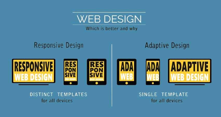
What is Responsive Web Design?
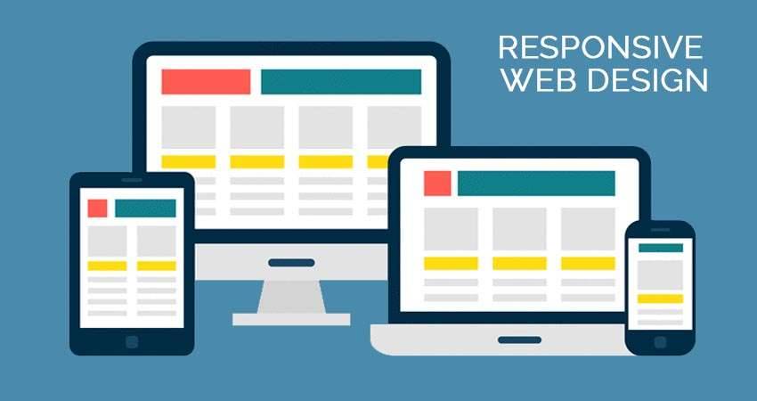
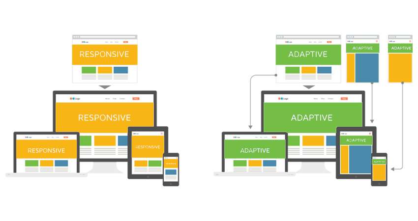
According to Wikipedia, Responsive Web Design (RWD) is an approach to web design which makes the web pages render well on the variety of devices and windows or screen sizes. In simple words, you can say that RWD is a type of web design which can adjust according to the type of device like the laptop, mobile, tablet, PC etc.
RWD aims to provide the optimal viewing experience for the users as the layout can adjust the minimum of resizing, panning, and scrolling. The reason behind this flexibility is the fluid grids used for making this layout which allows the design to work regardless of any screen size. RWD can be compared with a scenario where there is like a single ball which shrinks and grow according to the different hoops.
What is Adaptive Web Design?
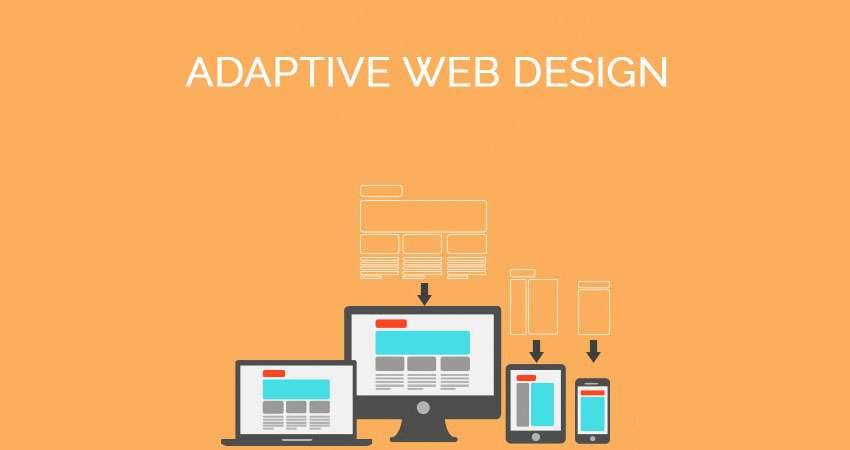
According to Wikipedia,Adaptive Web Design (AWD) is an approach to web design which promotes the creation of multiple version of web pages in order to better fit according to the user’s device. In simple words, you can say that AWD is a type of design where we create multiple version of the single web page according to the different devices so that it can fit well into that.
AWD aims to provide the best viewing experience available on a particular device like a laptop, PC, mobile, tablet, etc. as there is a multiple version of the layout created for the each of this screen-sizes. Unlike RWD where a single ball goes through the different sized hoops, AWD can be compared with a scenario where there several balls available to you which can be used according to the hoop size.
Responsive vs Adaptive Web Design:-
In the previous section, we understood the concept of Responsive Web Design (RWD) as well as the Adaptive Web Design (AWD). We also discussed how it works according to the different scenario.
With RWD the layout is determined on the client-side because the same layout is to be used for all the screen-size while with AWD the layout is determined on the server-side as there are different layouts according to different device & OS.
RWD is a one-size-fits-all type of the approach as the one you only need to design one layout for a single web page while AWD doesn't follow this approach because we have to design multiple version of layouts for a single web page.
Responsive layouts are harder to make comparisons to Adaptive layouts as in Responsive layout you have to think about all the device and make one layout while in the Adaptive layout you have designed multiple layouts according to the device.
Responsive Web Design offers you more flexibility in your website than Adaptive Web Design as RWD can work on any screen-size while AWD can only work on the designated screen-sizes, other than that will be a huge struggle.
Responsive Web Design loads much faster than its counterpart in most cases as the responsive website only needs to load the single layout while adaptive websites need to load all the possible layouts which takes a while.
Adaptive Web Design increases the complexity of your work or the project compare to Responsive Web Design as in AWD you have to create many layouts which are not the case in RWD.
AWD requires a large team of developers for handling the complexity which increases the project budget while in case of RWD a small team is enough to design one single layout which will be useful in all scenarios.
Responsive Web Design is more SEO friendly compared to the Adaptive Web Design. So if your client is interested in doing the SEO on his/her website in the future, you should use RWD, but if he/she is looking for a standalone app then AWD is a good choice.
With AWD, The designer is able to optimize the advertisement on the website based on the data for the smart devices which is not the case with RWD where the advertisements get lost on the screen.
AWD allows the designer to build the best possible UX for a particular device while in the case of RWD you can not build a specific design for a particular device.
Now, let’s compare both the design based on its features which will give you an idea about which is the best one for you.
Conclusion:-
So after reading thousands of blogs, analyzing lots of statistics and talking with the industry experts, we conclude that there is no unanimous choice between the responsive and adaptive design.
In most cases, it is better to go for RWD as it is a one-time investment which gives you great return every time and it decreases the load time of your website as well. But if somebody is a newbie and looking to make a website for a particular device, he/she should use AWD as it is easier to create and it allows the developer to build the best possible UX for a particular website.
Final Thoughts:-
We hope after reading this article, all your confusion about the best web design will be removed and it will help you make better choices in the future while designing a particular website for your client, company or the business.
Recent Blog


Services
Build Your Agile Team Today..
Inquiry Now


